Safari 的 borderRadio 在 scale 变化下失效
提供结构:
<div class="sup">
  <div class="sub"></div>
</div>

.sup {
  width: 100%;
  overflow: hidden;
  border-radius: 8px;
}
.sub {
  width: 100%;
  height: 233px;

  transform-origin: center;
  background-image: url(xxx.png);

  border-radius: 8px;
  transition: transform 0.3s;
}

.sub:hover {
  transform: scale(1.3);
}
得到结果:
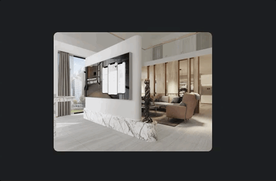
Safari 的 scale 过程中,border-radius 是失效的,直到 scale 执行完毕 但在 chrome 无异样
使用 clip-path: content-box;
clip-path: 使用裁剪方式创建元素的可显示区域。区域内的部分显示,区域外的隐藏。 clip-path: content-box: 使用 content box 作为引用框。
使用 -webkit-mask-image: -webkit-radial-gradient(white, black)
使用 radial gradient 防止子元素的内容显示在父元素的边界之外。